This article describes how to use a measure to filter a Power BI visualization, and the different behaviors of a same filter between different visuals.
Every visualization in Power BI has a Visual Level Filters section that by default includes all the columns and measures included in the visualization. This section can include additional filters over columns and measures. The Visual Level Filters section is the only one accepting a measure as a filter, whereas Page Level Filters and Report Level Filters only accept columns as a filter.
A measure used as a filter requires a target for the filter itself. A visual has an implicit definition of the target of the filter made by the columns (or by a subset of the columns) used in the visual. The user interface of Power BI does not feature a specific tool to specify a target for the filters defined at the page and report levels. This is the reason why measures can only be used as filters in visual level filters.
In Power BI it is possible to create a measure filter working at a granularity that is different from the one shown in a report by the visual. However, this technique gets different results depending on the visualizations used in the report, and it can have unexpected or counter-intuitive side effects in the measures used in the report. The goal of this article is to explain how to use a measure as a filter in a Power BI visualization, controlling the granularity and the possible side effects, all the while writing measures that will provide the correct results and avoiding unexpected behaviors.
How to apply a visual level filter in Power BI
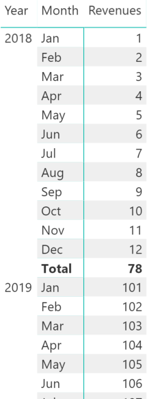
Consider a simple data model reporting revenue by date. A matrix without any filter shows the following data.

In the Visual Level Filters section, the Revenues measure can have a filter as in the following example that requires Revenues to be greater than 10.
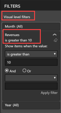
As one might expect, by applying this filter the visualization reduces the rows displayed and filters out the months between January 2018 and October 2018. Indeed, those months display a Revenues value under or equal to 10.
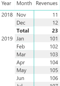
The matrix visual applies a measure filter at the cardinality defined by the rows of the matrix itself. In the previous example, the cardinality is year and month.
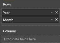
This was intuitive because both year and month were displayed in the visual. However, if one drills up the matrix to only show the year level, the filter is still applied to both the year and month columns, evaluating the Revenues measure for every month before applying the filter condition. This is clear when navigating from one level to another. However, looking at the report in a static way it might be counter-intuitive.
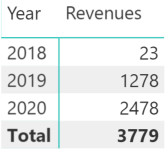
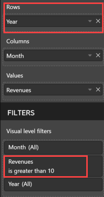
Moreover, only the Rows section of the matrix visual defines the granularity of a visual filter based on a measure. In fact, by moving the Month attribute to the columns section of the matrix, the result is different and all the months since January 2018 are visible.

The reason is that the visual filter now only has the Year as a target, because it is the only attribute applied to the Rows section of the matrix. Thus, the filter should now read as “only include years when Revenues is greater than 10”.
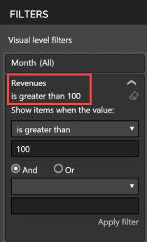
In fact, by increasing the filter to 100, the entire row for the year 2018 is removed from the visualization as shown in the following example.

A measure used in the visual filter is evaluated at a certain granularity defined by the visual. This evaluation generates the combination of values at the filter granularity that must be included in the visualization, even though the total is displayed at a different granularity. For a matrix visual, the filter granularity is defined by attributes applied to the Rows section of the matrix, ignoring the attributes applied to the Columns section.
Differences in measure filters between Power BI visuals
Power BI allows developers to easily change the visualization type. Because different visuals might have different criteria to establish the granularity for a measure filter, changing the visualization type with a measure filter active might provide unexpected results.
For example, consider the previous matrix with Year on rows, Month on columns, and a filter on Revenues that must be greater than 10. All the months were visible, and the filter was applied at the year level. By transforming that matrix into a Clustered Column Chart, the result no longer includes months between January 2018 and October 2018.
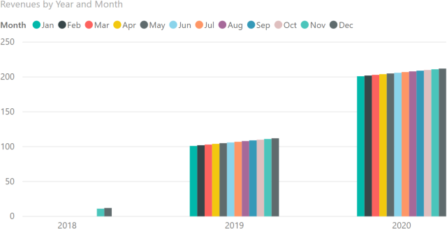
The measure is now evaluated by Year and Month, and not only by Year. The semantic is now, “only include months when Revenues is greater than 10”. However, we did not change anything in the properties. The Month attribute that was on the matrix columns is now in the chart legend.
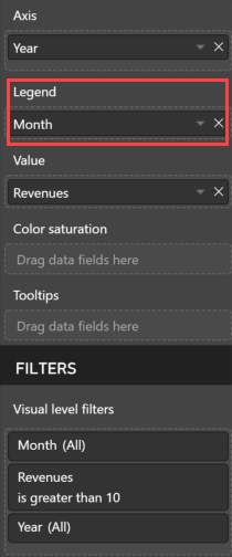
Thus, a chart evaluates the measures used in visual filters at the granularity defined by combining the Axis and Legend sections of the chart. There are no differences between applying attributes only to Axis, or to Axis and Legend. The resulting granularity of the measures used in visual filters is the same and combines all the attributes. For example, the same filter is obtained by applying both the Year and the Month attributes to the Axis section and drilling up the chart so that only the year level is visible.
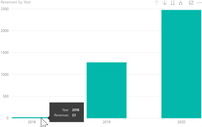
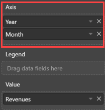
The Revenues measure is still evaluated for each year and month. In fact, the Revenues value for the year 2018 is 23, which only includes months with a value greater than 10 (November and December 2018).
Controlling measure filter granularity
By knowing that the cardinality of a measure filter can include attributes that are not visible in the report, it is possible to define a more complex filter logic without having to write any DAX code. For example, by applying the Year and Customer attributes in the matrix rows and the Month attribute in the matrix columns, the filter semantic is, “show customer Revenues greater than 9,999 in the year displayed”.


By drilling down the matrix rows including the customers, it is visible that the filter is applied at the year level. The three customers highlighted in red in the following screenshot (19042, 19083, and 19039) do not have any Revenues greater than 9,999 for any months. The filter is applied to the customers at the year level, though the evaluation of the measure in the matrix also includes the month level. Customer 19081 highlighted in purple has one month above 9,999 and two months below – this case will be useful later in the article.

By moving the Month filter in the matrix rows, the filter semantic changes to: “show customer revenues greater than 9,999 in a single month”.

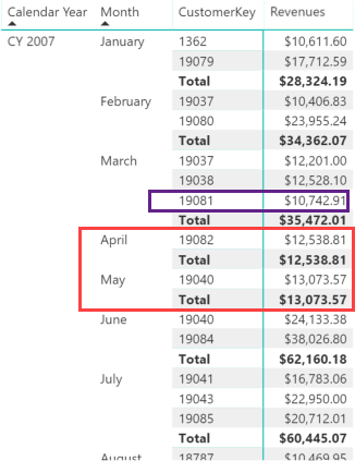
The result of the matrix by year is now different; those months with a Revenues amount under or equal to 9,999 are now excluded by the filter. For example, compare the Revenues result for 2007 in the following report – the numbers are lower compared to the previous reports.
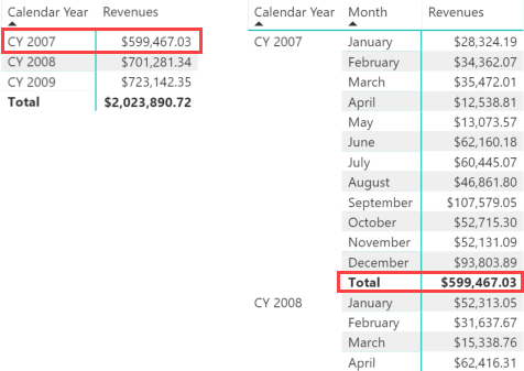
By drilling down at the customer level, it is clear that any combination of customer and month with Revenues less than 10,000 is not included. This is particularly evident in April and May 2007 where only one customer is included, as highlighted in red in the following screenshot. Moreover, if a customer has revenues greater than 9,999 in certain months, and other months that don’t go over the filter, only the revenues for the months greater than 9,999 are considered. Thus, the yearly amount of a customer only includes the months greater than 9,999. For example, in the following screenshot customer 19081 in purple has revenues only in March and not in February and April – which were displayed in the previous matrix for that same customer.
This technique is interesting to filter an entity that is not displayed in the report. The filters shown in this section of the article only includes customers that have a certain revenues amount. However, the granularity used to compute and apply the filter is controlled by other attributes included in the visualization. It is important to understand this logic to obtain the correct results.
Unexpected behavior of complex measures using measure filters
Combining a complex measure with a visual filter at a granularity that is different from the current visualization can have unexpected results. For example, we can replace the displayed measure with a year-to-date calculation (Revenues YTD) keeping the filter on Revenues.

If the filter were applied at the year level for every customer, one might expect the same result. However, the filter is applied to every combination of customer and month, resulting in a strange report.
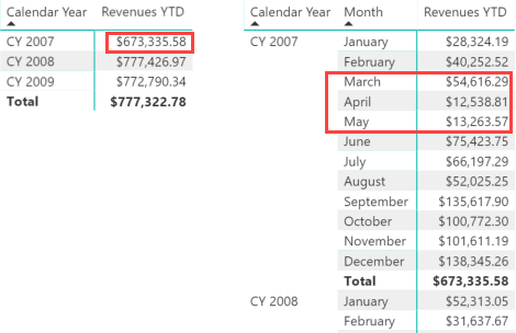
The value of 2007 is different than any other 2007 total from the previous reports shown in this article. Moreover, the values displayed in April and May are smaller than March in 2007. For a year-to-date calculation, this seems wrong. However, if we think about the semantic, there is an explanation for this. The filter for April 2007 is “show the Revenues YTD measure for customers that have a Revenues amount in April 2007 greater than 9,999”. For this reason, customers displayed in one month could be ignored in following months.
For example, customer 19037 is shown in both February and March because it has more than 9,999 in Revenues for each of those two months. This is visible by drilling down the data at the Customer level including both Revenues and Revenues YTD in the visualization.
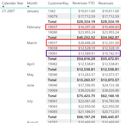
Also consider the case of customer 19081. Even though it is only displayed in March, their Revenues YTD value is larger than Revenues. This is because the Revenues YTD measure considers the sum of previous months, even though Revenues may be lower than the threshold of 9,999.
Because the filter granularity is Year-Month-Customer, only the filtered combinations are also considered in the year total. This explains another unexpected result. The Revenues YTD computed in December is different from the one computed for the entire year – yet another unexpected behavior for a year-to-date calculation. At the month level, only customers with Revenues higher than 9,999 in December are considered, including all the months in their Revenues YTD calculation. However at the year level, all customers with revenue higher than 9,999 in at least one month are considered; their revenues for the entire year are summed to compute Revenues YTD regardless of the monthly filter applied to the Revenues measure.
The total of Revenues YTD 2007 is smaller than the Revenues measure filtered by year. Indeed, it is excluding customers that have a Revenues value greater than 9,999 at the year level, without having any month over that same limit (see customers 19043, 19083, and 19039 already highlighted in one of the previous examples).
The effects of this discordance between measure filter, granularity and displayed values are made more evident by using a clustered column chart with the same granularity of Year and Month. In this chart, we display Revenues YTD and we filter the Revenues measure. Finally, we also include the customer in the filter granularity as a hidden column in the Axis section of the chart.


The numbers are identical to those displayed in the previous matrix – the problem is just more evident because of the graphical representation. One would expect a year-to-date measure to show continuous growth over the year, something that clearly is not happening here.
However, the problem is that the filter is applied at a granularity level not consistent with the expected behavior of the measure displayed, at the granularity displayed. In order to get the expected result – filtering the customer revenue by year and not by month – it is necessary to control the measure applied to the filter, so that the resulting filter does not interfere with the measure displayed.
Controlling side effects of measure filters in Power BI
The previous problem can be solved with two different approaches: using a specific measure as a filter in the report; or creating a measure that displays the value, applying the filter in DAX instead of relying on the hidden attributes to define the filter granularity in the report.
The first solution requires a measure created specifically to be a filter in the Visual Level Filters section. If the purpose is to filter those entities (e.g. customers) that have a certain Revenues amount for the entire year, the measure could simply ignore any value at the month level. For example, Revenues Year is a measure that computes the Revenues at the year level, regardless of the date granularity used in the current filter context.
Revenuess Year :=
CALCULATE (
    [Revenues],
    ALL ( 'Date' ),
    VALUES ( 'Date'[Calendar Year Number] )
)
This measure must be used in the Visual Level Filters section instead of Revenues, whereas Revenues YTD is still the measure displayed in the chart.
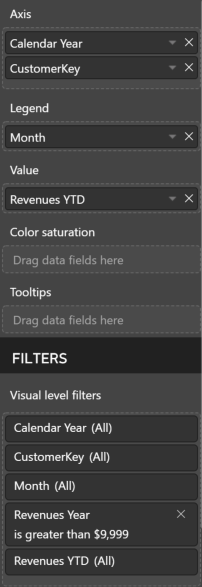
Using this configuration, both chart and matrix consider the same customers used by the first matrix shown in the “Controlling measure filter granularity” section.
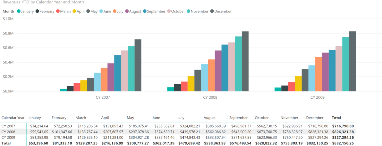
The second solution requires a Revenues YTD Filtered measure that includes the filter over customers. The following implementation internally uses the same Revenues Year measure used as a filter in the previous solution.
Revenues YTD Filtered :=
VAR FilterCustomers =
    FILTER (
        Customer,
        [Revenues Year] > 9999
    )
RETURN
    CALCULATE (
        [Revenues],
        DATESYTD ( 'Date'[Date] ),
        FilterCustomers
    )
By using the Revenues YTD Filtered measure in the chart Value section, the Visual Level Filters section is no longer used in the visual as shown in the following screenshot.
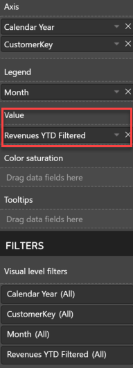
This moves the complexity over to just the DAX code. Furthermore, the resulting data model could be easier to use by users that only design the report for an existing model, without a deeper knowledge of the details about visual level filter granularity described in this article.
Conclusions
Power BI accepts measures as filters only at a single visual level, and it does not accept measures as filters at the page level nor at the report level. The granularity to which a measure filter is applied partially depends on the visual type: for example, there are differences between a matrix and a chart. The granularity of a measure filter can be controlled by using columns not displayed in the report, but this technique requires a deeper understanding of the possible side effects. In order to avoid unexpected results, one might prefer to write either specific measures to be used only as a filter at the visual level, or measures that embed the filter in the measure itself – rather than relying on standard measures used in both visualizations and filters.